Role: UX/UI Design, UX Research
Tools: Adobe XD, Miro, Loom, unDraw
CraftLab
Project
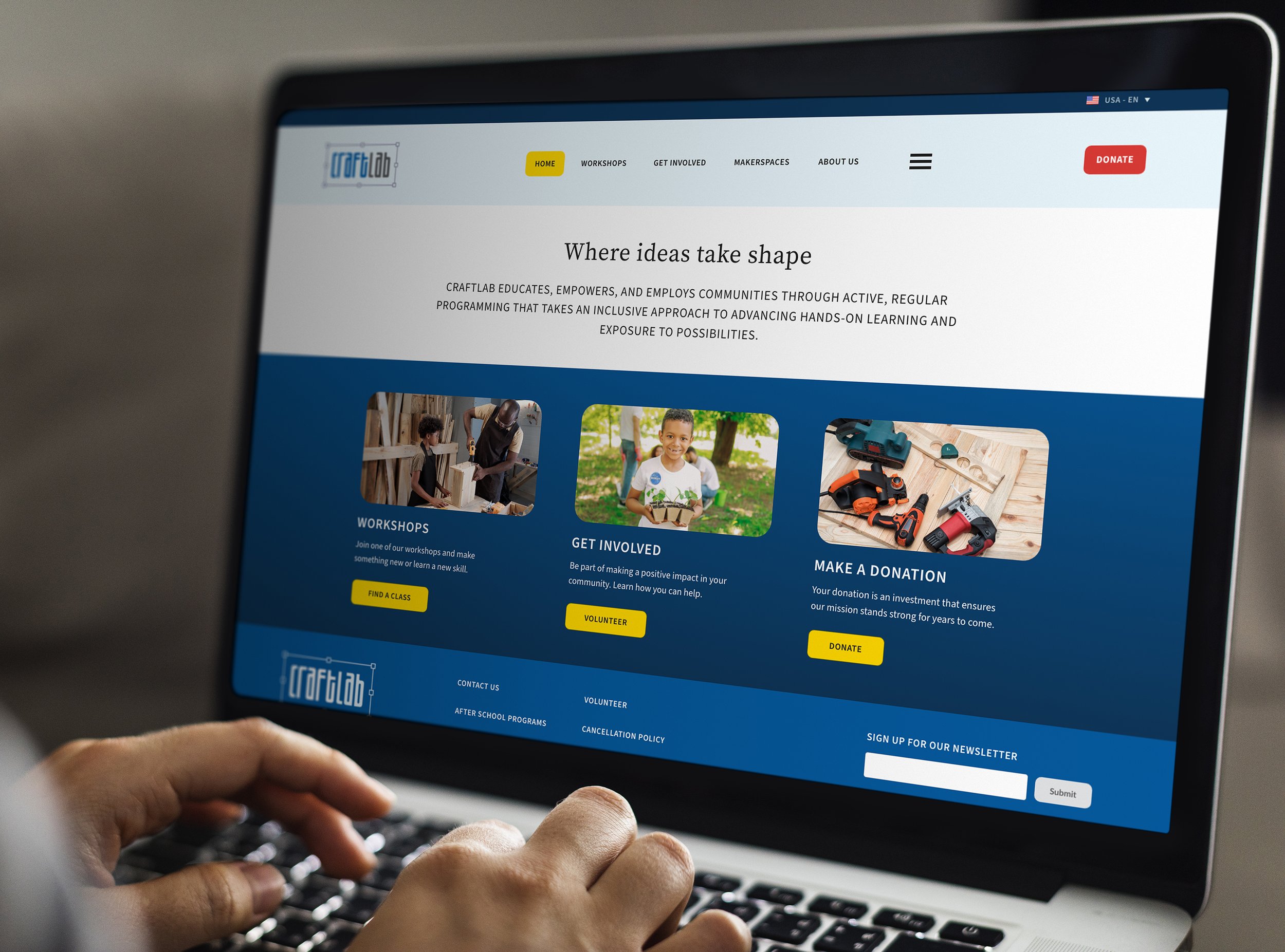
My task was to design a website for a maker space focusing on community involvement, volunteering, and classes involving several vital elements. Design a user-friendly website interface. Ensure that the navigation is intuitive and information is easily accessible. Consider a clean and modern design that reflects a maker space's creative and innovative nature. Design a dedicated section for volunteering. Set up a section outlining the classes and workshops the maker space offers.
Challenges
Volunteer spaces often face challenges in responding promptly to volunteering inquiries. Users may experience delays or no response after sending out a request to volunteer. Maintaining an updated calendar of events and classes can be a significant and demanding task.
Research
I conducted qualitative research, encompassing interviews, usability studies, and the construction of persona hypotheses. To initiate the process, I engaged a select group of friends with volunteering experience and a history of visiting maker spaces. I began by posing essential questions, including:
What are some reasons that drive people to volunteer?
What are some frustrations people find when wanting to volunteer?
How can we improve their experience?
After these initial interviews, I created persona hypotheses to represent different types of users, their goals and frustrations.
Personas
Samuel
Age: 42
Occupation: Graphic Designer
Goals:
Make friends.
Learn new skills.
Have an excuse to leave the house.
Samuel recently moved from Florida to Buffalo, NY, with their partner and dog. Samuel enjoys the outdoors and learning new skills. Since Samuel works from home, getting to know new people and making friends organically has been difficult. Samuel hopes volunteering allows them to make friends that share similar interests.
Samantha
Age: 30
Occupation: Managing Technical Consultant
Goals:
Helping others.
Putting learned knowledge into action.
Make a positive impact in her local community.
Be a role model to her niece.
Samantha is an environmentalist who wants to impact her local community positively and be a role model to her 7-year-old niece. She is vegan, has a vegetable garden, likes running, and is learning to skateboard. She walks or takes public transportation when commuting to work.
Site Map
Sketches
Wireframe
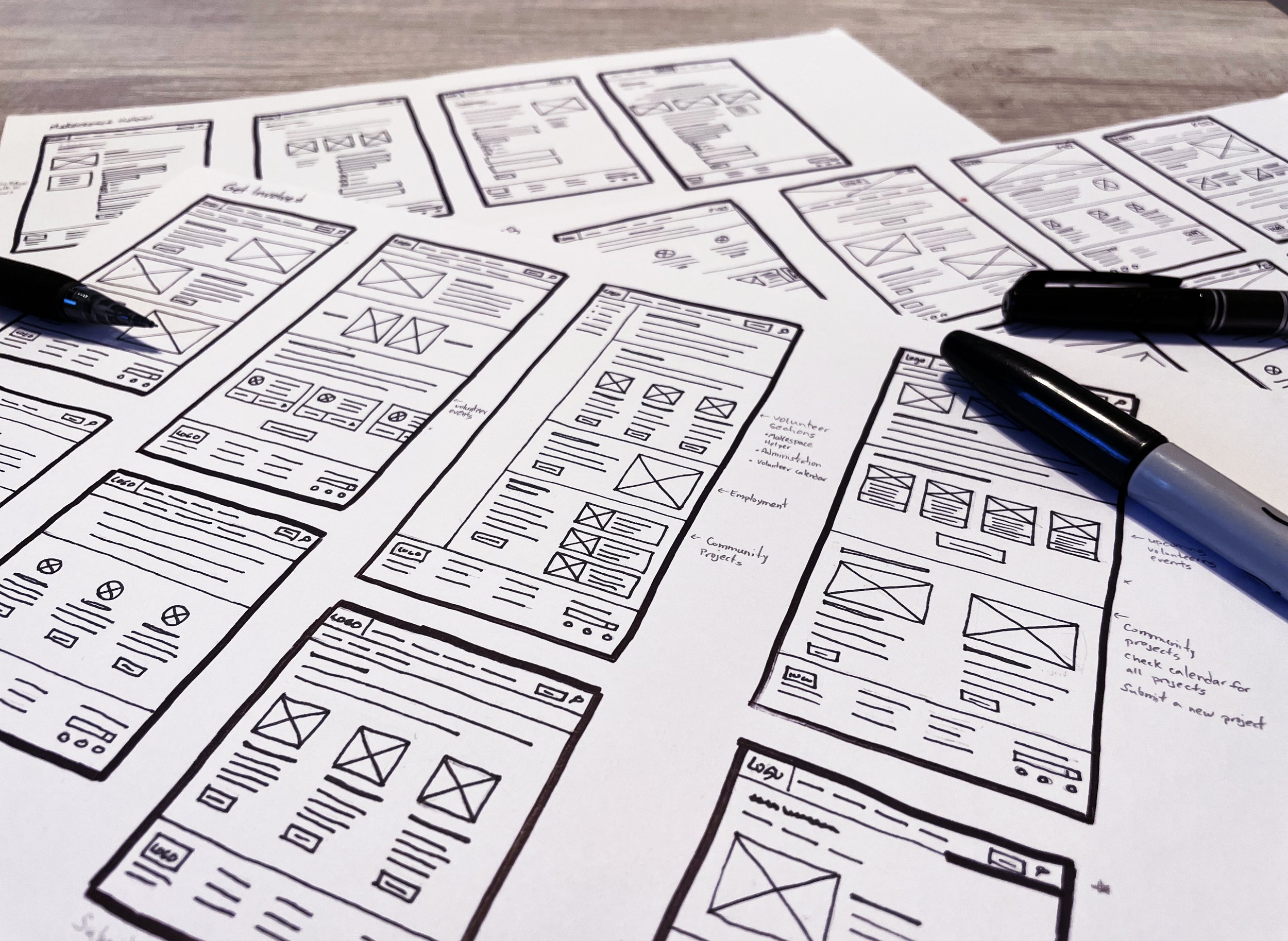
I initiated the design process by sketching paper wireframes. Once I found some layouts I was happy with and grasped the fundamental flow, I translated these sketches into digital wireframes. Subsequently, I reviewed the digital wireframes to pinpoint missing steps or confusing elements. Upon reaching satisfaction with the digital wireframes, I transformed them into prototypes. This prototype was then subjected to a usability study to collect feedback from real users.
Insights
Observations of users’ frustrations locating the volunteer waiver form inform reworking the navigation and adding a direct link to the form from the navigation.
During the usability study, some users express confusion utilizing the sub-navigation. I address this by utilizing a common website layer to make the sub-navigation clear.
Affinity Diagram
Addressing Challenges:
The Volunteer Waiver is hard to find
During the first usability study, it was discovered that the Volunteer Waiver form was difficult to find because it was buried within a page. This could likely result in trouble locating and completing the form, potentially leading to a drop-off in volunteer sign-ups or incomplete submissions.
To improve the accessibility and visibility of the waiver form, I decided to move it to its page. This change would make it easier for users to find and access the form, as it would be accessible directly from the navigation and buttons located within the content of the volunteer pages.
Addressing Challenges:
Confusing sub-navigation
During the usability study, I discovered that some users were confused and did not realize that the sub-navigation was clickable. The sub-navigation was not visually distinct or did not behave in a way that users expected based on common web design conventions. This could be due to its placement, color, size, or lack of visual cues that typically indicate clickable elements.
To resolve this, I first evaluated the current Information Architecture to ensure it aligns with user expectations and mental models. Then I took an approach to utilize a common website layout. This involved making the sub-navigation more visually prominent and ensuring that it followed common design patterns that users are familiar with.
Iteration
I conducted a lo-fi prototype usability study that helped me guide the designs from wireframes to mockups. The study involved a small group of users who were asked to complete a series of tasks using the lo-fi prototype. I observed their interactions and took notes on their feedback. This feedback helped me identify areas where the design could be improved. I then conducted multiple iterations to refine user flow and accessibility. The final design was much more user-friendly than the original lo-fi prototype.
Design Kit
I developed a friendly and cheerful color scheme, meticulously selecting colors and incorporating lively unDraw illustrations to craft each element. The goal was to establish an inviting and energetic atmosphere, transforming the maker space into a visually engaging and welcoming hub for all enthusiasts. While creating this design kit, I utilized WebAIM to ensure that color combinations adhered to WCAG AA color contrast standards.
Takeaways
Deciding on the organization of the navigation was challenging. I wanted it to be easy to read and have room to grow. After some iteration rounds, I used "Get Involved" instead of "Volunteer" since that section could include multiple Programs besides Volunteering. To avoid confusion, I added "Volunteer" as a prominent button on the home page. Another solution could be moving "Makerspaces" inside "About Us" and moving "Volunteering" and "Programs" to separate sections. For a project like this, I would have wished to have the opportunity to conduct various usability studies and continue to test the navigation usage.


